····························································································································································
what's all this? what does this portfolio cover?
-
what work, exactly?-
anything else i should know?
This portfolio covers the body of work I have completed academically at the University of the Incarnate Word between 2019-2022. Given I switched majors around a couple times, there's a lot of different work here to cover.
---
- 2019-2020 (3D/Animation/Game Design) - Which is mostly Maya/Zbrush work
- 2020-2021 (Graphic Design) - Which is all Adobe Photoshop/Illustrator work
- 2021-2022 (BA Art) - Which encompasses various work from 2021 to 2022.
- 2022-2023 (BA Art) - More focused painting/drawing work.
-Photography - has been given its own section as well, given the amount of it over the years.
---Also, if you just want a deep dive 60-page read through of everything covered here with extra descriptions included with each piece, there's a downloadable powerpoint & pdf version here as well.
3D Animation/Game Design (2019-2020)-1st Year - contains material from:drawing 1 · elements of design ·
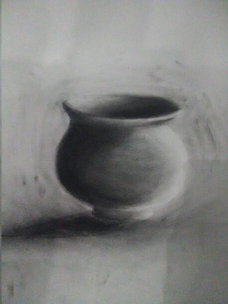
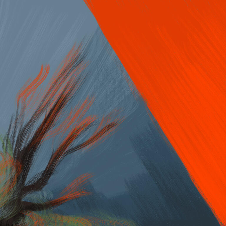
intro to animation · organic modelling · hard surface modelling · personal work··············································{Drawing I}⁽¹⁾ "The Nice Charcoal Pot" - One of many assignments relating to form and the application of charcoal. Not too much to explain with these, just various light and contour exercises. Figured I’d just leave it at this charcoal pot.
-
Also as far as the other assignments went, they were fine, but as far as putting high-rez pictures of contour banana peels and pots, I figure I'd just save you the bandwidth.
··············································{Elements of Design}⁽²⁾ "Element" - Out of the few works that I was able to put out in my Elements of Design class before Covid-19 hit in early 2020, this is the only one that I can really say holds up to scrutiny. That, and as the University of the Incarnate Word attempted to roll out online classes, this was one of a few classes that I would end up failing as a result of the confusion in the pandemic.··············································{Intro To Animation}⁽³⁾ "Early Animation" - I started off my time at UIW wanting to go into animation, and while I immediately realized that didn’t mean I would be drawing a lot, I still was eager to learn the 3D animation software that was being taught. I think this eagerness is somewhat present in the early assignments done for this class, what with the bounciness and such. If I did end up continuing with 3D animation, I'd probably want to still be animating as stiff and bouncy as this stuff was.
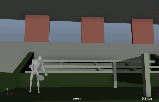
···⁽⁴⁾ "Later Animation" - I’d like to say I wanted to be inventive as early on as I could with my work in the class, as seen with the very unneeded background assets I cobbled together for the tennis animation and lava jump animation. I don’t think I was doing too bad at the assignments, but I was definitely beginning to burn myself out already.
···⁽⁵⁾ "Final Walk, ⁽⁶⁾Fall, ⁽⁷⁾& Throw" - These three animations were assigned to us as our final, and by this point I think my highschool era work ethic had me cracking under the pressure a bit. Like I got them done, but I crunched so much time off that I didn’t have time to fix the baseball animation when our school's copy of Maya crashed halfway through. Twice!! At the least, I don't think I scored too bad on these overall.
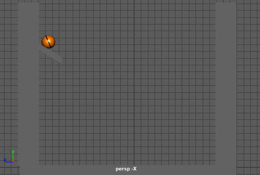
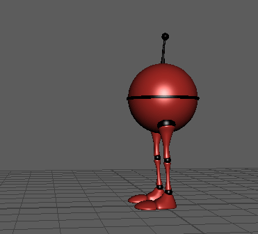
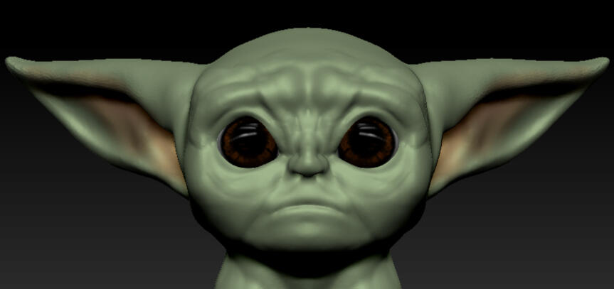
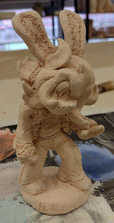
··············································{Organic Modelling}⁽⁸⁾ "Weekly Speedsculpts" - Every week that I was in this class, we were instructed (I think on Mondays?) to complete a quick sculpt of various pop culture characters that the instructor wanted us to make. I think we had 10-15 minutes per sculpt, so I don’t feel terrible about the quality of most of these. We were also given notes after each sculpt to improve our later work. I remember these fondly.
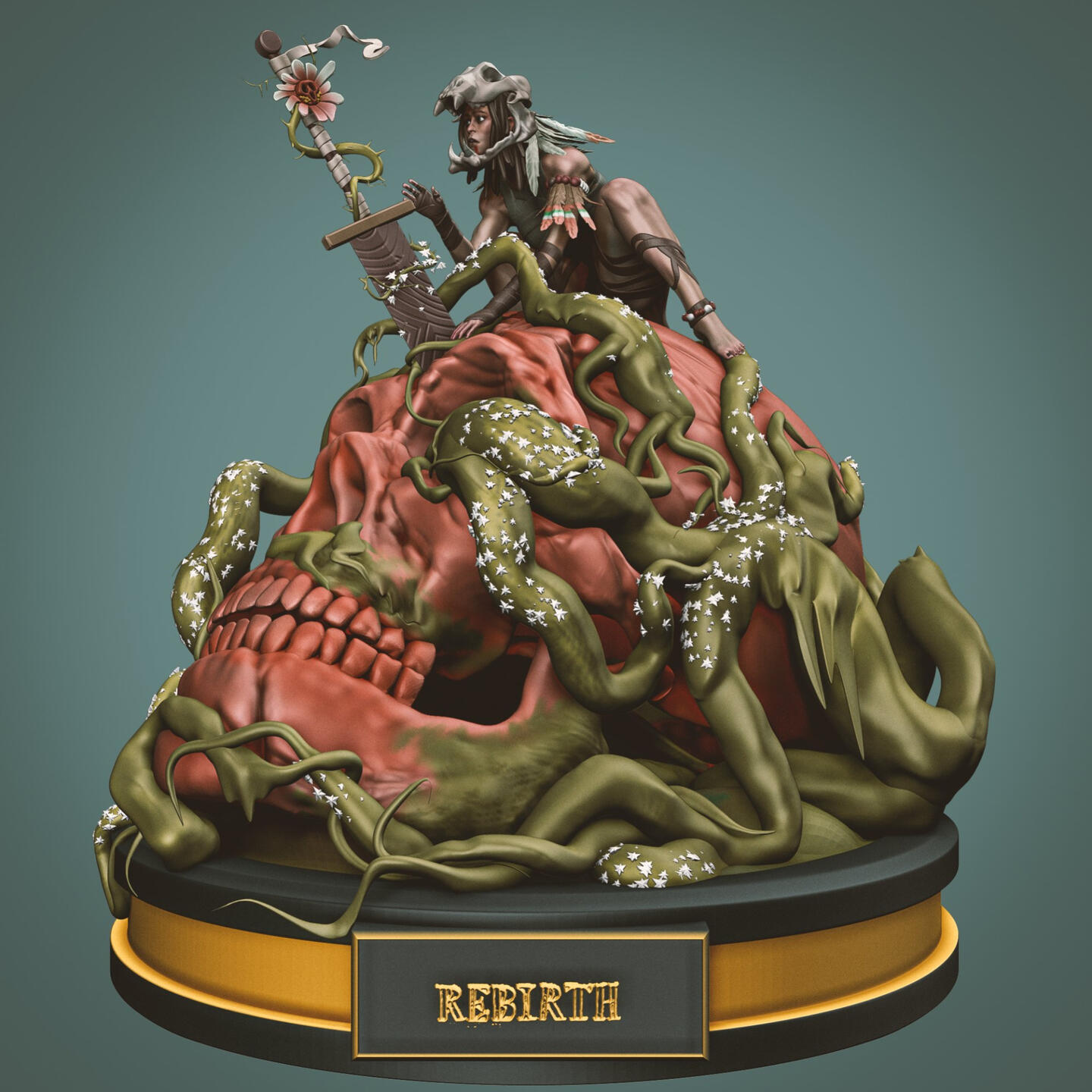
···⁽⁹⁾ “Rebirth” Final Sculpt - We were prompted to complete a sculpt for our final as based on one piece of concept art given to us. Given I still have a complementary award pin for “best organic sculptor for the project” that represents the department, I think I did ok.
-
I ended up staying in the lab for a few late nights just to get all the detail-work done. Definitely worth it.
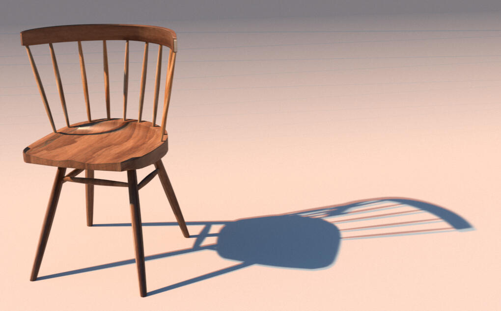
··············································{Hard Surface Modelling}⁽¹⁰⁾ "Nakashima Chair" - I don’t have too many memories from my second semester, but I do remember loving getting this chair modelled. Probably just because my family used to have one like it. It was a lengthy project, and one that got most things important to 3D modelling stuck in my head to this day. As for the chair itself, Its basic despite the polished wood look. It’s mostly warped cylinders.
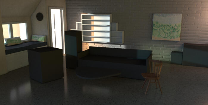
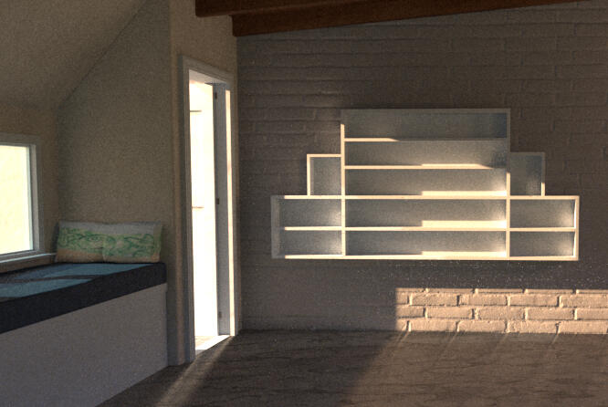
···⁽¹¹⁾ "Showcase Room" -
If there’s anything I’ll keep being upset about having to rush, it’s this room model. I don’t even have the last render I got of it right before it was due, and given the switch to canvas the year after, I’ll probably never find it. At the least, if get another copy of maya, I’ll try rendering it again. There used to be pillows and lamps and whole table here that just aren’t documented anymore.
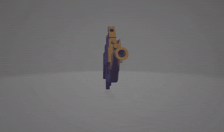
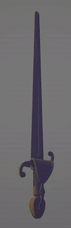
···⁽¹²⁾ "Sword & ⁽¹³⁾Gun Models" -
This was one of the few projects I managed to at least semi-complete once the pandemic started. If it wasn’t for an already existing disinterest in the 3D major, Covid would be easily blamed for just destroying my ability to work for the first semester it was present. Like the room before, I lost the renders made for these, but I had model files. Hope you like spinning.
··············································{Personal Work of 2019/2020}⁽¹⁴⁾ "Kitty Bobo Reanimated Segment" -
For the week we got off on Spring Break, I decided to make a 2-minute video that partially reanimated a clip of a cartoon pilot called “Kitty Bobo” for a friend of mine that lives out in California and has these silly animal guys made up. Half of this was done during Spring Break of 2020, and then the pandemic first hit, and I realized I had more time to put together the full scene I wanted to, mostly.**************************

Skulls
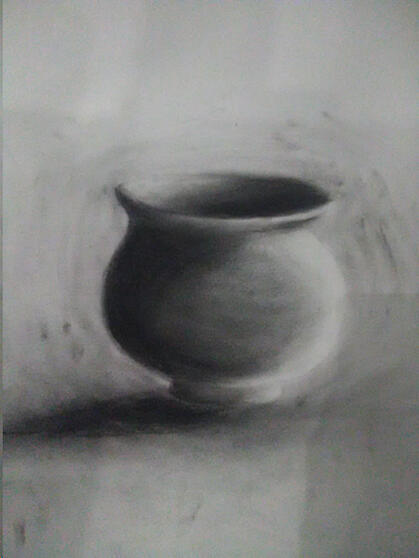
"The Nice Charcoal Pot" - Drawing Assignment ⁽¹⁾

"Element" - Elements of Design Assignment ⁽²⁾

"Ball Bounce Across The Room" - Animation Assignment ⁽³⁾

"The Big Step" - Personal Animation

"Goofy Fox Spin Jump" - Practice Animation

"Ball Turnaround" - Animation Assignment

"Lava Jump" Animation Assignment

"Sack Fall" - Animation Assignment

"One-Legged Jump" - Animation Assignment

"Tennis" - Animation Assignment ⁽⁴⁾

"Advanced Rig Walk" - Animation Final ⁽⁵⁾

"Backwards Fall" - Animation Final ⁽⁶⁾

"Baseball Throw" - Animation Final (Was Rushed/Unfinished) ⁽⁷⁾

"Baby Yoda" - Practice Speedsculpt ⁽⁸⁾
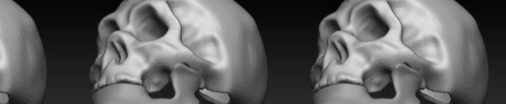
"Skeksis" - Practice Speedsculpt
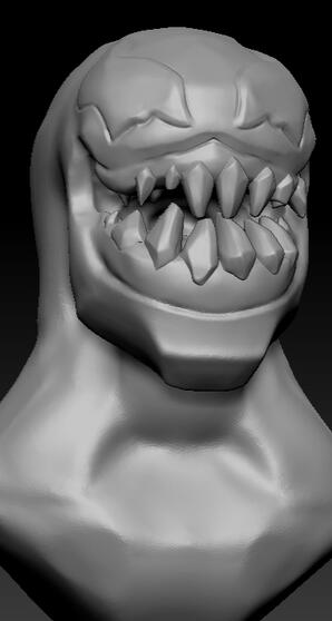
"Venom" - Practice Speedsculpt

"Rebirth" - Organic Modelling Final Project ⁽⁹⁾

"Nakashima Chair" - Personal Favorite Render ⁽¹⁰⁾
"Showcase Room" - Latest Recovered Render ⁽¹¹⁾

"Showcase Room Layout" - Shelf Render

"F2000 Gun" - Hard Surface Modelling Assignment (Missing Textures/Materials) ⁽¹³⁾

"Sword" ⁽¹²⁾

"Ross Eyeroll" - Key Shot

"Messin With Chad" - Kitty Bobo Reanimated Personal Project ⁽¹⁴⁾


Graphic Design (2020-2021)-2nd Year - contains material from:foundations of design · graphic design software · image lab · typography · writing for media · personal work
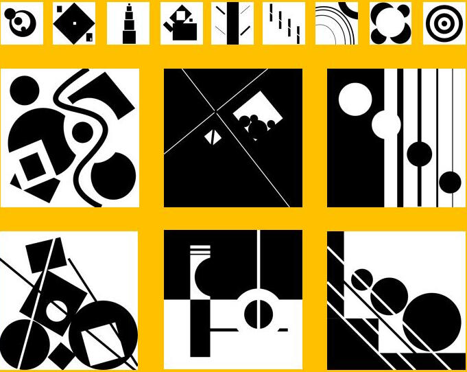
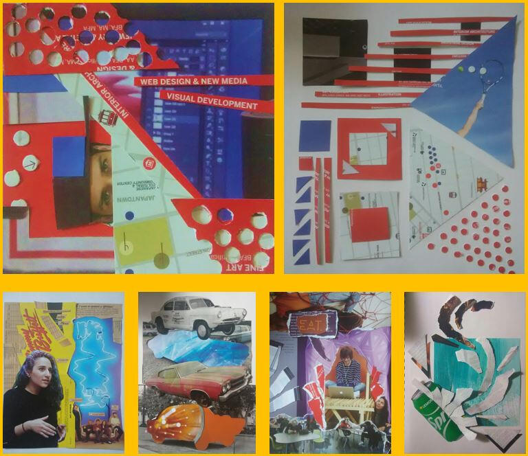
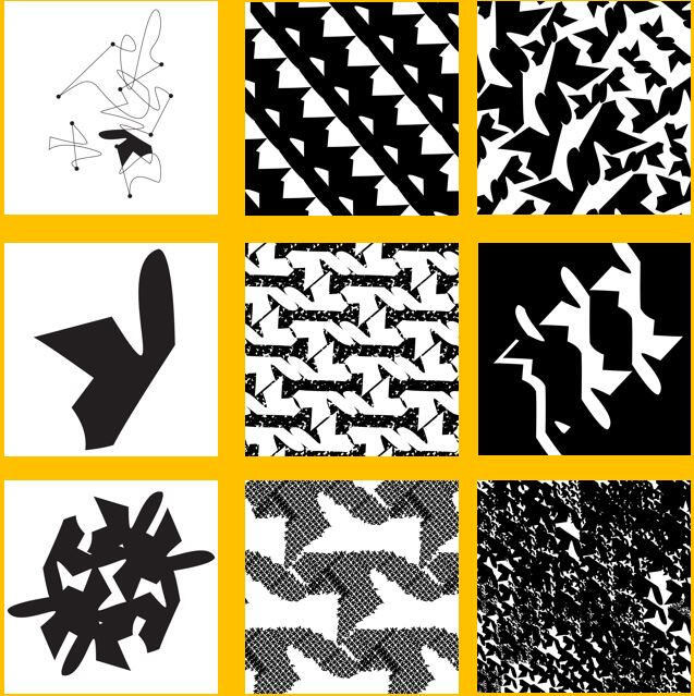
··············································{Foundations of Design}⁽¹⁾ "Exploring Point, Line & Planes" - Project 1 - This project, alongside Graphic Design as an encompassing major, was definitely the step I needed to help redefine what I wanted as an artist. You don’t really think about how simple shapes can interact in so many interesting ways until you’re pushed to work so minimally. I’m tempted to try it again, honestly.
The project, I mean.
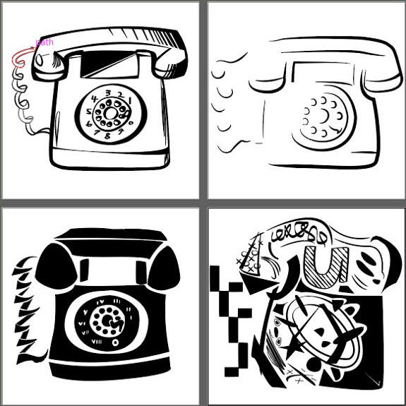
···"Object Abstraction" - Project 2 - I remember a lot of people having trouble with this one for some reason. Maybe I did too, without thinking it. I was definitely a lot more illustrative than I needed to be when It came to abstracting a telephone. With a little refinement, this would almost look classy.
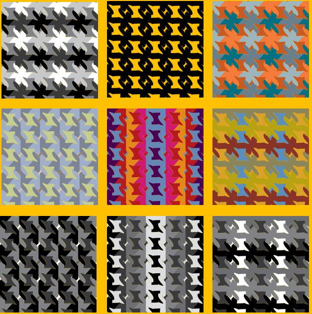
···"Pattern" - Project 3/4 - I bundled project 3 & 4 together, sure, but really the basic shape shown in the 4th square encompassed the rest of the semester for this class. It was definitely a project that I had to be really inventive for, but by the end of this section at least, I felt like I was pushed up against the limits of what I could do with it.
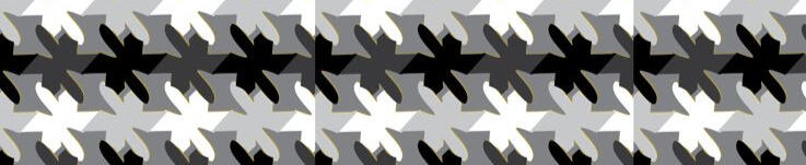
···"Color & Value" - Project 5 - By the end, we were stuck with one pattern. All we could change now was the greyscale value, or the color of the pattern (within a small palette.) If there was anywhere further I could’ve gone with this, I don’t imagine it would’ve been all that much further.
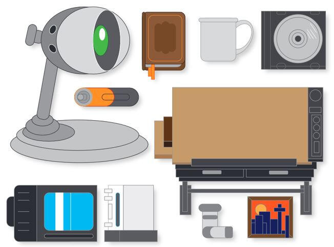
··············································{Graphic Design Software}"10 Objects" - Graphic Design Software was a fun class honestly. On most early sessions, we’d practice replicating logos or symbols for the sake of learning the pen tool. And for all that prep work? I think this assignment actually didn’t let us use it at all. But it was still fun to build stuff in our houses out of basic shapes. Nothing wrong with that.
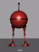
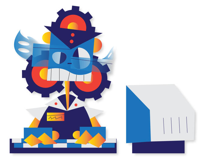
···"Robot" - This was a simple project at the end of the day. We just drew up some robots on paper, replicated them with vector tools, and gave them simple palettes of color. It was fun getting to design a little character that made the most of its shapes. I took a bit of influence from the work of Rob Renzetti and his "My Life As A Teenage Robot" TV show, in how the design is very flat and comical looking. Plus I thought it would be fun to design a robot that was just operating in a very mundane environment, but other than that, not much else to say.
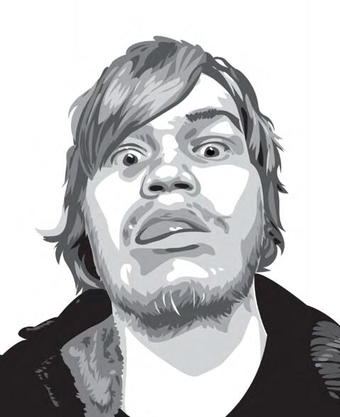
···"Face Trace" - Self Portrait Assignment - Can’t remember for the life of me as to why I chose the scruffiest photo of myself to vectorize, but I’m just glad I remembered how to shave once everyone started coming back to campus. Really though, I still love this piece. I got a surprising amount of detail out of a somewhat limited amount of values to work with, and I think it holds up because of it.
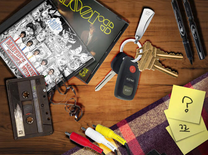
···"Initial Collage" - Not like, “the first collage in the course” but like, literally an initial in a collage. I’ve been wiped out enough by this week that I have to keep reminding myself of that. For this image, I decided to ask my photographer friend if I could borrow some of their pics to throw together in this, and they were happy to see the end result I think. I’m still happy with this at least.
···"Flat Collage" - Then again, it kinda was the initial collage, huh. Anyway, this was a fun image to compile together. I think I remember my professor asking if I just took a photo of the elements in the top left together because I did the shadows and masking convincingly enough. I’d be prouder of this whole thing if the cables and tablecloth didn’t kill the whole illusion though.
···"Textured Collage" - Kind of a mess looking at it now, but still think this one is fun. I think I may have gone nuts with one of those gold star sticker sheets just for this sparkly set of textures. Definitely captures what I think was some kind of time anxiety that I still admittedly have.
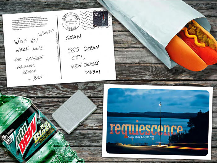
···"Final Flat Collage" - While a lot flatter looking than the other flat collage, this one has a lot of fun elements. I had a good time putting together the postcard, and an even better time making the stamp feel convincing. If those stamp making websites still exist (or exist at all), I might get a pack of these at some point. The mountain dew still looks completely squished though.
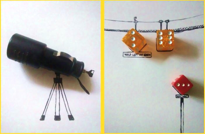
··············································{Image Lab}"Objects On Paper" - I don’t think I expected to have two classes that focused a lot on collaging stuff together in one semester, and this assignment should have tipped me on to that earlier. I think I’ve seen some cutesy stuff like this online before, and I think I pulled off the look those people must’ve been going for. I just can’t resist the car charger telescope. It really was as simple as drawing legs underneath it.
···"Various Paper Collages" - I think these proper scrapbook-like collages are where I had some of the most fun this semester. I still have the top left piece pinned on my wall. I can’t remember if we were given prompts for any of these or if we were just told to dig out of the recycling bin and go ham for a few minutes. Either way, really fun set of practice assignments.
···(remaining work to be added)

Asterisks

"Exploring Point, Line & Planes" - Project 1

"Object Abstraction" - Project 2

"Pattern" - Project 3/4

"Color & Value" - Project 5

"10 Objects" Adobe Illustrator Assignment

"Robot"
"Face Trace" - Self Portrait Adobe Illustrator Assignment

"Initial Collage" - Photoshop Assignment

"Flat Collage" - Photoshop Assignment

"Textured Collage" - Photoshop Assignment

"Final Flat Collage" - Photoshop Assignment

"Objects On Paper"

Untitled


